The Top Platforms to Build Your Best Website

Jun 28 | 2017

An important step in advertising your services, growing your brand or business or sharing your stories is creating a website that showcases your talent. A striking, beautiful website will catch the eyes of readers and potential customers and draw them to what you have to offer. Website creation in 2017 involves less work for better results than ever before. Which website builder is the best for you?
Wix
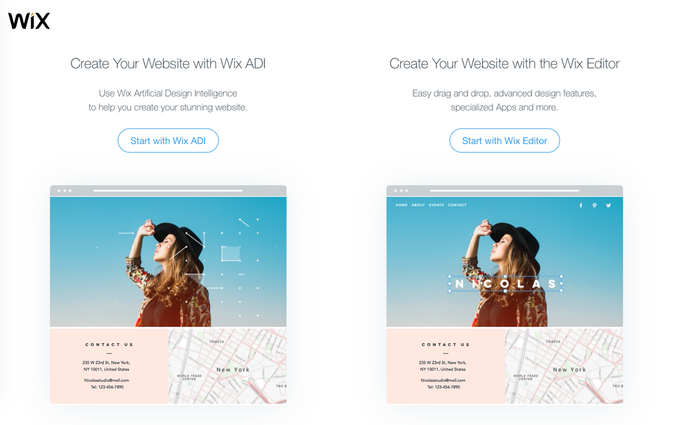
Wix brags about its Wix ADI (Artificial Design Intelligence), an enthusiastic robot that will design a first draft of your website based on a few questions about its purpose and your interests. Of the four website builders described here, Wix involves the least amount of work while still producing gorgeous results.

You can create a Wix account with an email/password or by logging in with Facebook or Google. The excited website AI will ask questions about the purpose of your website—business, commerce, portfolio, personal, etc.—and suggest templates based on your answers. I started by choosing “Portfolio/CV.” It asked me to specify what kind of website (it was the only platform to do this) and when I typed “Writing,” suggested “Writing Portfolio.”
The AI offers a selection of designs to help it learn your taste. And like the loading screen of a videogame, the ADI creates the “first version of your homepage” before proceeding to a step-by-step tutorial of the design and editing process.
Before the ADI takes over, Wix offers the option to go straight to the editor and start from something closer to scratch, but I see no reason to do that, even for someone with experience. For a beginner designer, trust the robot.
Wix set up my website with an impressive video header background right from the start and filled it in with coherent sample text (not that lorem ipsum nonsense language loved by text editors). Each template’s colors, animations and content are customizable. The tutorial is a bit laggy and slow but comprehensive and a huge help. Preview mode shows your website on desktop and mobile.
In about an hour, you’ll have a website that looks like it took a team a few days to design. Wix, like all of the four platforms discussed here, is free to start. It offers lots of tips, help articles, SEO assistance and more, while its subscription plans offer custom domains, storage and Wix ad-free sites.
Squarespace
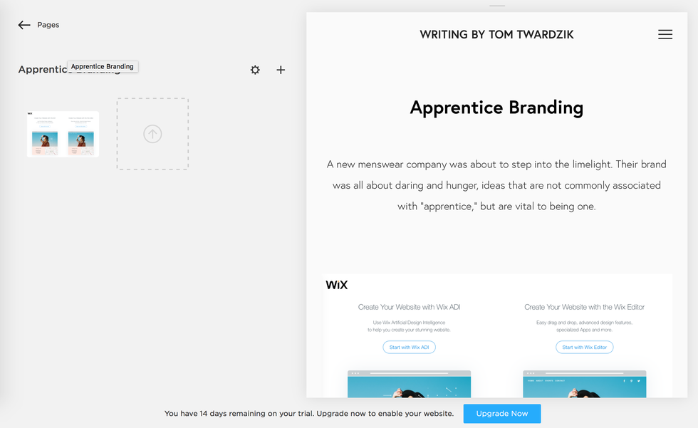
Squarespace offers a 14-day free trial (no credit card required) to test its services and see if it’s the right fit for you. It asks a similar set of questions about what the website will be used for and, without the personality of the Wix AI but with the same polish, builds a beautiful website full of placeholders for you to replace with your own text and images.

The initial difference between the two platforms is that Squarespace lacks the extremely helpful tutorial that Wix offers. Without that kickstart, I wasn’t sure where, exactly, to begin or what to do about many of the placeholders.
This might have been easier to figure out if the interface was as intuitive as Wix’s, but it’s not. Where Wix defines clear levels of editing (pages, sections, section text, section images, buttons, etc.), Squarespace seems to be a free-for-all of editing: every aspect of a section must be edited separately, and moving from text to image to buttons quickly becomes tedious. Unlike the simple-yet-thorough Wix interface, Squarespace forces users into the highest-power zoom, editing the specifics without easy access to the broad design or content.
There is no instant preview comparable to Wix (Wix was laggy but at least it was present), little in-editor help and frustrating controls. Suddenly, I’d accidentally created a blog. Then, I couldn’t easily navigate to it.
Squarespace offers more analytics than Wix, including a traffic overview, site search queries, popular content and RSS subscribers. But as a user who has made websites using several platforms but who has little experience manually building all of the specifics of a page, Squarespace frustrated me beyond saving. Use a free service, like Wix or one of the others below—visitors won’t be able to tell the difference, but your wallet will.
Weebly
Weebly, refreshingly, displays itself as another enthusiastic, colorful website builder. Sign in with email, Facebook or Google and start answering its brief quiz. Question 1: Do you want to sell online? This first question indicates Weebly’s slightly different priority, though you can choose “No” and add a store at any time.

Again, choose from a list of mostly good themes and let Weebly create the first draft of your site. Thankfully, it follows the creation with a series of pop-up boxes that nudge you along through a kind of tutorial.
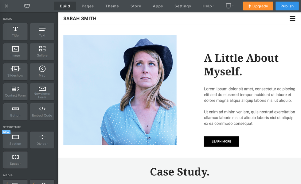
The Weebly editor relies heavily on smooth drag-and-drop actions for an editor that is vastly better than that of Squarespace. The “Parallax” scroll effect (also available on the other services) is particularly gorgeous. It also offers video backgrounds and other features that come with premium subscriptions.
There is significantly less pre-setup from Weebly than from Wix and there doesn’t seem to be an undo button. Weebly stands out with its apps, such as the Facebook “Like” button, Social Boosting, a “Testimonial Builder” and many more. Some are free and some are premium-only, but all are extremely simple to implement.
Weebly offers site stats and help that are similar to Squarespace but at a cheaper cost. Weebly’s subscription tiers are almost the same as those of Wix, with an entry subscription (with a free domain) that costs $8/mo. and the next level at $12/mo. Weebly is a simple, smooth and modern website builder to rival Wix. The choice comes down to platform aesthetics.
Strikingly
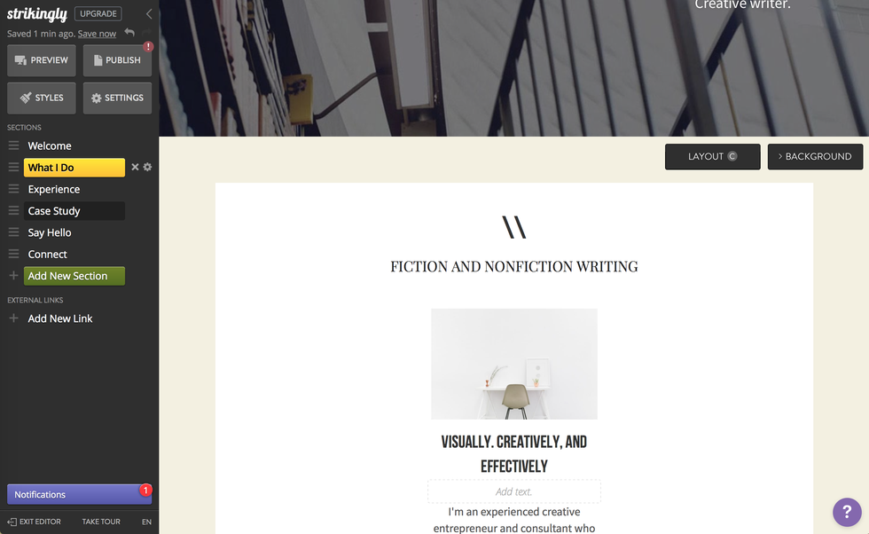
Strikingly offers the same feature set as Wix when you log in with email or Facebook. If the Strikingly homepage was built with Strikingly, then I’m already less impressed. It offers a tour instead of a tutourial, though it recommends chatting with its “Happiness Officers” for help. It must be emphasized that the editor is extremely functional and easy to use.

The editor is simple but not as glossy as the others. Strikingly feels like it hasn’t quite escaped the WordPress/blog/single-page-stream format, although it’s almost there. It emphasizes sections on a scrolling page over multiple pages.
While it gives nice previews of tablet and mobile layouts, its mobile customization features are lacking. It does have an app store similar to Weebly’s, but with less options.
Conclusion
The choice really comes down to Wix and Weebly for their excellent combinations of features, polish, services and prices. There’s really no reason to pay for Squarespace when other platforms do it better and, if you’re a light user, for free. Wix and Weebly offer slightly different features at slightly different price tiers but their base offerings are basically identical.
Do you prefer lots of clicking on sections to reveal a side menu containing all of the customization options, or a sidebar from which you drag sections, text boxes and apps onto the page? Would you rather the AI do most of the work, or would you like more initial choices with a recommended path? These questions will help you decide between two fantastic, modern, powerful website builders.


